Analysing Maternal Mortality and the Factors Associated with it
I conducted a data visualization project aimed at exploring maternal mortality and its underlying causes. For this purpose, I utilized the World Data Bank (WDB), which houses datasets from global organizations like the WHO, UNESCO, and various other agencies. I gathered data related to maternal mortality and various potential contributing factors from countries worldwide. Subsequently, I employed this data to develop four visualizations with the goal of providing a more comprehensive understanding of the deficiencies present in countries experiencing elevated maternal mortality rates.
Figure 1 presents a global map that visualizes geospatial data illustrating maternal mortality rates in various countries. This visualization allows readers to gain insights into regions where maternal mortality is particularly high.
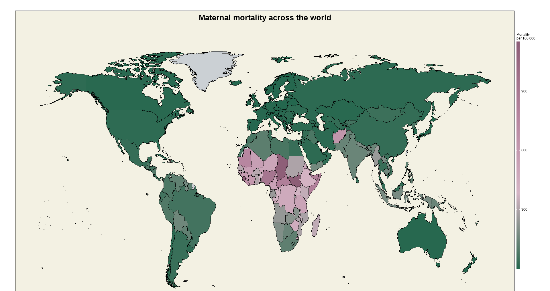
Figure 2 was crafted to demonstrate the significant role of women's education in reducing maternal mortality. Leveraging the principles of the grammar of graphics, we incorporated additional factors such as contraceptive prevalence and cases where pregnancies were not attended by medical professionals. This visualization offers readers a clear understanding of how countries prioritizing women's education tend to outperform those with fewer educated women in lowering maternal mortality rates.
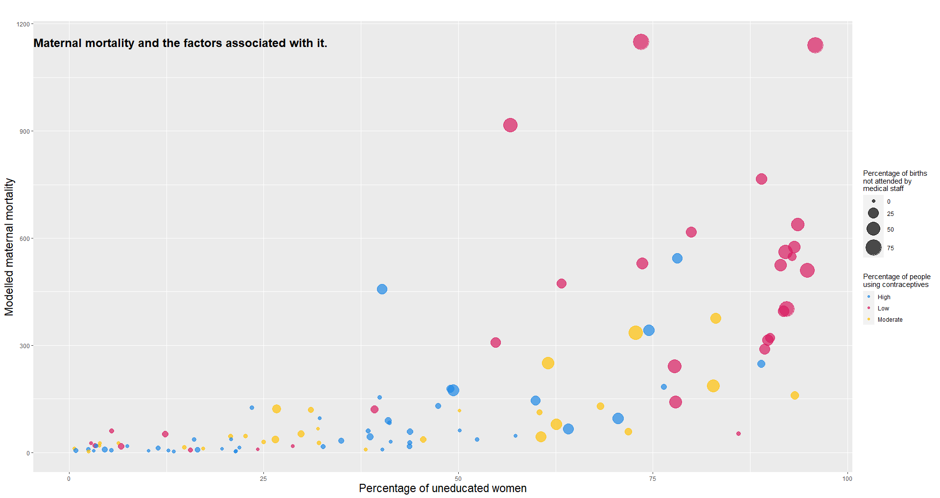
Figure 3, designed as a circular bar chart, compares the prevalence of contraceptive practices between top-performing and worst-performing countries in the fight against maternal mortality. This visually appealing representation aims to draw the reader's attention and underscore the importance of contraceptive use and other practices in reducing maternal mortality.
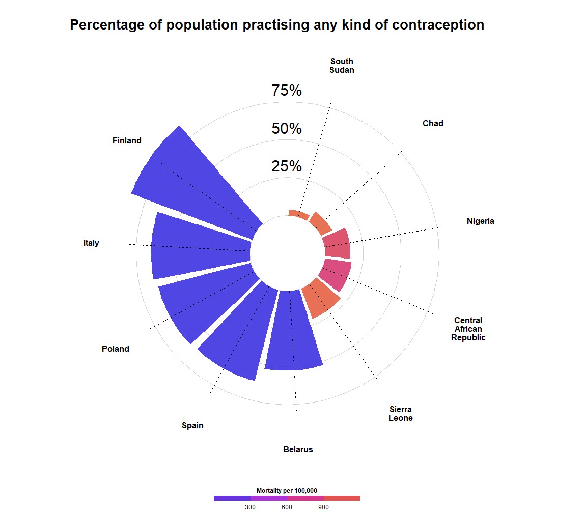
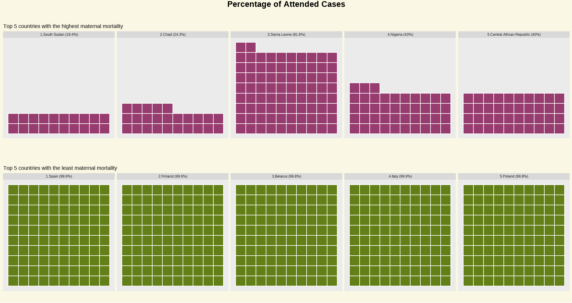
Figure 4, depicted as a waffle chart, offers a comparative visualization to raise awareness about the impact of proper medical care during live births on reducing maternal mortality. It highlights the stark contrast between countries where live births are professionally attended, resulting in significantly lower maternal mortality rates, and those where such attendance is lacking, leading to higher rates of maternal mortality.
In creating these visualizations, accessibility was a key consideration. For instance, Figure 2 incorporates color-blind-friendly scales from ggplot to ensure inclusivity. Additionally, color palettes were selected from Venngage, an online platform offering palettes designed to accommodate color-blind individuals. The project was implemented using R, and the source code is available for reference here.